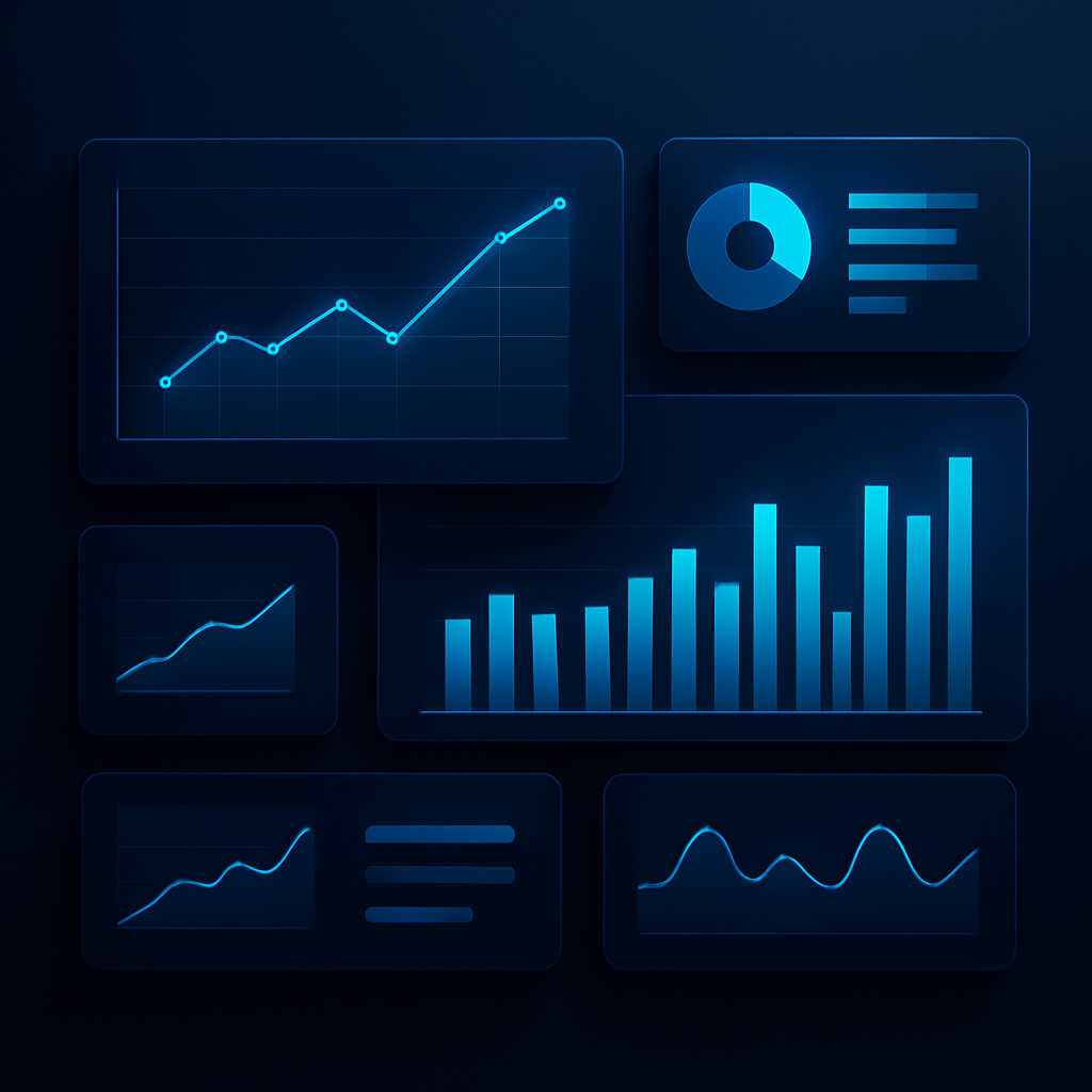
Plenty of businesses invest in dashboards that nobody opens after the first week. The data is technically there, but it does not help anyone make a decision, so people drift back to the spreadsheets and gut feel they trusted before.
A dashboard that gets used is designed around decisions, not data. The goal is not to display everything you can measure, but to answer the few questions that actually shape how the team acts each day.
Start with the decisions, not the metrics
Before choosing a single chart, ask what decisions this dashboard is meant to support and who is making them. Every element on the screen should help answer a real question. If it does not, it is noise competing for attention.
- Identify the handful of questions the audience asks most often.
- Show the few numbers that directly inform those questions.
- Make the most important metric the most prominent thing on the screen.
- Cut anything that is interesting but does not drive a decision.
Make the meaning obvious
A number on its own rarely tells you whether to act. Good dashboards add context: a comparison to last period, a target, or a clear signal when something is off track, so the right reaction is obvious at a glance.
A dashboard succeeds when someone can glance at it and know what to do next, not just what the numbers are.
Keep it current and trusted
The fastest way to kill a dashboard is for people to stop trusting it. If the data is stale or the numbers do not match reality, the team quietly abandons it. Reliable, automated, up-to-date data is what keeps a dashboard alive.
When reporting is focused, clear, and dependable, it stops being a chore and becomes part of how the team thinks. Decisions get faster, conversations get sharper, and the dashboard earns its place at the center of the operation.
SmartWave Team
Data & Reporting